TL;DR
Most webbased speed tests have link areas above the fold that are too small.
Of the top 10 speed tests, only Internet Speed at a Glance and M-Lab have large enough link areas.
Contents
Introduction
At Top Ten Most Common Web Accessibility Issues it is stated that Link areas are too small is a top 10 accessibility error.
Based on the WCAG guideline target size it becomes clear that the target size should be 44x44 pixels.
Method of measurement
![]() For this test, the 44x44 Pixel Cursor Bookmarklet is used. With this bookmarklet a cursor of 44x44 pixels
is shown instead of the standard cursor.
For this test, the 44x44 Pixel Cursor Bookmarklet is used. With this bookmarklet a cursor of 44x44 pixels
is shown instead of the standard cursor.
The clickable elements of the speed test (as shown above the fold, zoomfactor 100%, screensize 1920x1080 pixels, browsersize 1920x918 pixels) are "inspected" with the 44x44 cursor.
When there is at least one clickable element smaller then 44x44 pixels, which doesn't have an equivalent link or control on the same page that is at least 44 by 44 CSS pixels and the element isn't an inline element (the target isn't in a sentence or block of text), the speed test fails this test.
When a speed test starts automatically we start testing when the speed test is completed.
Speed tests to test
Because this is a relative simple test, the unique speed tests as collected at ZOMDir will be tested.
The measurements
- Astound speedtest all visible clickable elements are large enough
- Bandwidth Place there are small visible clickable elements
- Bredbandskollen there are small visible clickable elements
- Broadband Internet Speed test (Gone) there are small visible clickable elements
- Broadband Speed Checker there are small visible clickable elements
- Cloudflare there are small visible clickable elements
- Comparitech all visible clickable elements are large enough
- DSLReports there are small visible clickable elements, the test didn't work
- Fast there are small visible clickable elements
- Fireprobe all visible clickable elements are large enough
- Google Fiber there are small visible clickable elements
- Internet Speed at a Glance all visible clickable elements are large enough
- LibreSpeed there are small visible clickable elements
- M-Lab all visible clickable elements are large enough
- Meter.net there are small visible clickable elements
- N Perf all visible clickable elements are large enough
- Ookla Speedtest there are small visible clickable elements
- Open Speed Test there are small visible clickable elements
- SamKnows there are small visible clickable elements
- SpeedCheck all visible clickable elements are large enough
- SpeedOf.me there are small visible clickable elements
- SpeedOf.me API Sample Page there are small visible clickable elements
- SpeedSmart there are small visible clickable elements
- Speedtest4.PHP all visible clickable elements are large enough
- TestMy.net there are small visible clickable elements
- Toast there are small visible clickable elements, the results not shown
- Which Broadband Speed Test there are small visible clickable elements
- Xfinity xFi Speed Test there are small visible clickable elements
Some examples
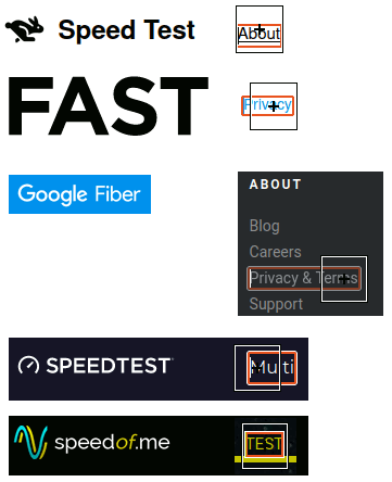
In the image below, you see some examples of too small link areas.

Note that usually the link area is too small in height.
Conclusions
- 20 speed tests have small visible clickable elements
- 8 speed tests seems to be fine
- Of the top 10 speed tests, only Internet Speed at a Glance and M-Lab have large enough link areas.